
Summarie the information by selecting and reporting the main features, and make comparisons where relevant.
TOEFL, IELTS, Personal Statement and CV Proofreading Services. › IELTS Writing › Summarie the information by selecting and reporting the main features, and make comparisons where relevant.
-
September 27, 2020 at 1:36 am
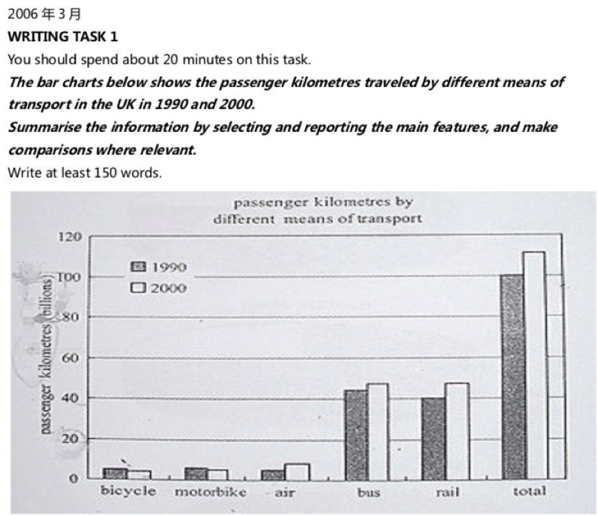
This bar chart illustrates the differences of distance taken by passengers for several transportations in two years, which has inflected the preferences of people for choosing tools for going out.
In 1990, bus and rail were obtaining the top, with 42 billions and 40 billions of passenger kilometres respectively. For other three(bicycle, motorbike and air) were much lower, all of them had passenger kilometres below 10 billions, which was quartered compared to other two.
One year later, the data was nearly same with little change lower than 10 billions. It was obviously that rail increased most from 40 billions in 1990 to 48 billions in 2000 and air as well as bus raised too. However, for other two types of transportation, a decrease was occurred.
The total amount of passenger kilometres was increased around 10 percent, which highly identified the overall increasing preferable for five transportations in UK. Because of the technology improvement, passenger kilometres may gave an sustainable increasing trend due to the advantages such as saving time.
Invalid [ Complete the revision of your first essay prior to resubmitting this one.]
You must be logged in to reply to this topic.